- Painting different interpretations of the scenes
- Designing the Ice Palace
- More illustrations for book

Hello and welcome to my Presentation Document. In this blog I will be documenting my final major project for uni from start to finish - illustrating "The Snow Queen" by Hans Christian Andersen. I will be posting regularly new ideas, thoughts and illustrations that pop up as I go. Hope you enjoy!
Monday, 14 April 2014
Week 11

Sunday, 13 April 2014
Varying Angles and Working Looser


This week I have been focusing on producing more possible illustrations for my final book.
As I mentioned in an earlier post I've begun creating images with the mindset working a bit more loosely and trying not to define objects or scenery depending on the image as much. I think this is making my images look a bit more impactful.
I have also been trying to vary the images so that some are more cropped in and others zoomed out with more of an emphasis on scenery.
I've been continuing with the quick composition ink paintings in my A3 book as well which has been aiding me in figuring out which layout would suit each illustration more.
 |
| Composition sketch I |
 |
| Composition sketch II |

| Kai and Gerda Reunite, Selina Quach, 2014 I have continued the red symbolism in this image as love is obviously a strong theme here. |

The Snow Queen's Kiss, Selina Quach, 2014
Here I tried zooming in which I think has worked well given the context. Their expressions are a key factor as well and I wanted to emphasise this by cropping in.

No Rest or Peace in her Eyes, Selina Quach, 2014
I worked on top of the original image (but kept the original in digital format - (the great thing with gouache is you can always alter with a bit of water whenever you need to!) to make her appear more surreal which I definitely prefer.

The Prince and Princess' bedroom, Selina Quach, 2014
I worked in more detail as opposed to loosely here as I felt it suited the lavish scene of the royal bedroom. Again, trying to vary the angle of the image

Tuesday, 8 April 2014
More Artist Inspiration
Angela Barrett -
 |
| The Night Before Christmas - Angela Barrett |
 |
| Anna Karenina by Leo Tolstoy - Angela Barrett |

The compositions in her illustrations are always inspiring and makes me want to go out of my comfort zone and be more experimental with mine. I love the mood and atmosphere she manages to portray in her images as well.
Yoshitaka Amano -
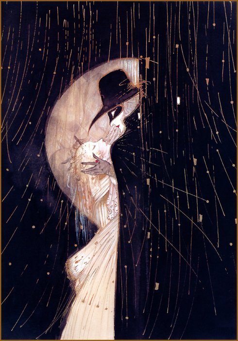 |
| Yoshitaka Amano |
 |
| Yoshitaka Amano |
Again, Amano's composition and the contrasting shapes/colours have been influential, particularly in illustrating the Snow Queen character. Her tall, grand figure dramatically contrasts Kai's much smaller figure which I emphasised in the painting below.
 |
| The Snow Queen and Kai on the Sledge, Selina Quach, 2014 Although red is the symbolic colour that ties Kai and Gerda together - meaning love - it can also represent other themes, such as danger. Here the red scarf indicates the latter more. |
Audrey Beardsley's work is similar in that she uses a lot of striking figures and simple, effective curving lines which have also been an influence on me.
 |
| A Suggested Reform in Ballet Costume - Audrey Beardsley |
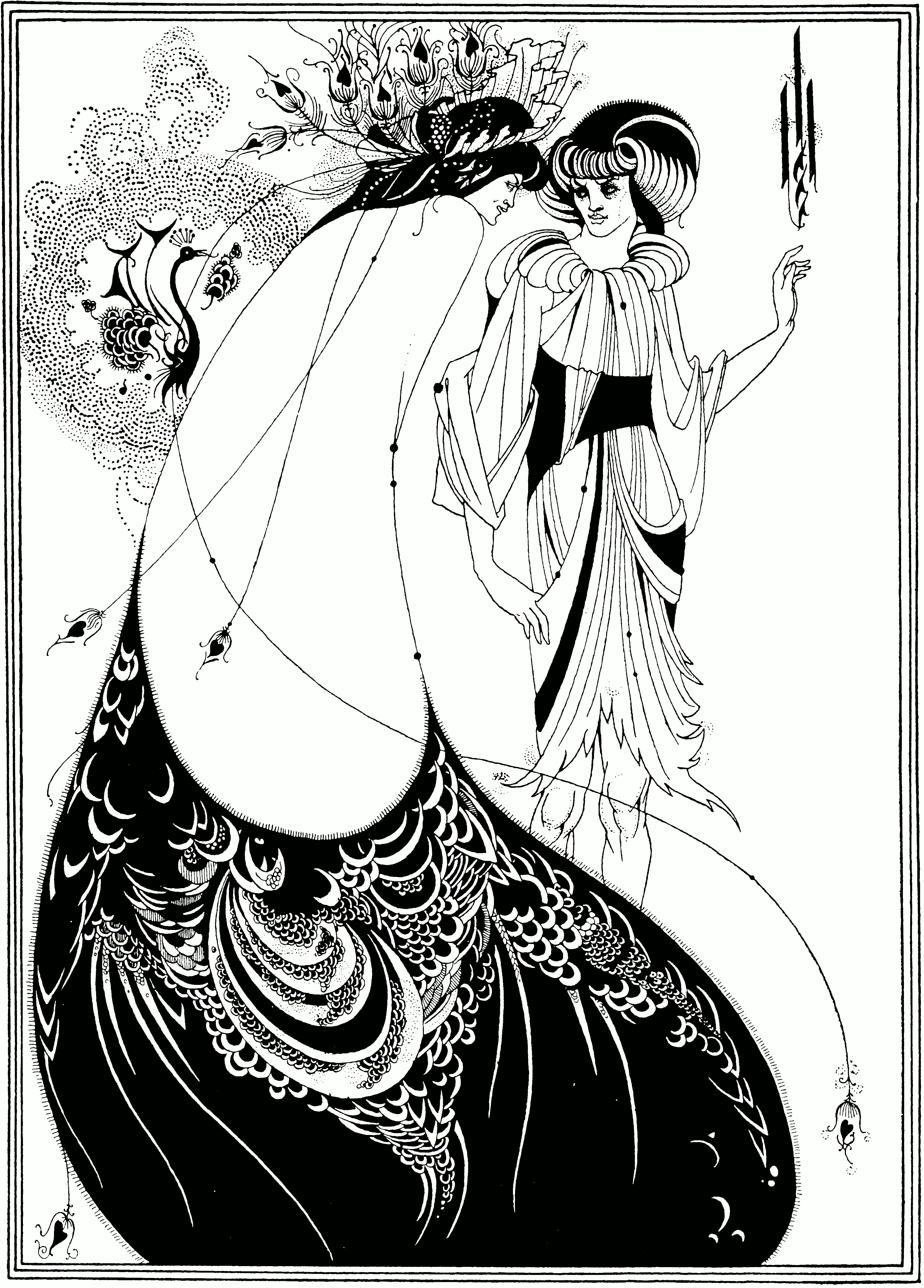 |
| The Peacock Skirt, Audrey Beardsley, 1983 |
Monday, 7 April 2014
Thursday, 3 April 2014
Formative Assessment
Today I attended my formative assessment with Jonny and Louise to see how I am going with this project. They seemed quite pleased with what I have been producing so far and their pointers have given me a clearer idea of the few weeks of Easter holidays ahead.
Below are some of the things we discussed:
Possibly adding a content page and to keep the writing aligned to the left for easier reading. The image below would work well as one with just a tree on one side for a contents page, or possibly as a title page.


Below are some of the things we discussed:
Possibly adding a content page and to keep the writing aligned to the left for easier reading. The image below would work well as one with just a tree on one side for a contents page, or possibly as a title page.
After speaking to Louise on Tuesday I had gone back and repainted the image of the Snow Queen and Kai, to make the Snow Queen appear less substantial which we agreed looked better and made a more impacting image. Another point that was mentioned was that the loose brush marks along the edges of some of my paintings could be left like that for my final book illustrations. I do quite like the contrast between that and the more detailed main image. I will be doing this for the rest of my paintings so that it is still an option after I've finished and begin to put the book together.
Some of the stronger elements in my smaller paintings such as the one below to the right is due to the variation of marks, ie. some larger ink marks with smaller detailed marks. In future paintings my aim will be to try and continue doing this.
I've found that with paintings that are entirely detailed can look slightly overwhelming such as the girl in the woods image.
As the story is very long I may make the text smaller so that I can fit more of the story on fewer pages as some of my paintings will definitely work better as landscapes on their own. Some of the pages could also have an extra, small illustration coming up from the bottom of the page etc.
I went to ask Katherine about binding a book and now have a clearer idea of how I should be laying things out. However, my priority at the moment will be to produce as many paintings as I can before I start planning out anything.
Tuesday, 1 April 2014
Creating a Dummy Book & A Timetable Update
The past couple days I have been making a dummy book in order to give myself a clearer idea of how my final book could look. I inserted some current illustrations that I may use for final images and the ones that I have yet to paint I sketched how it might look.
This has helped me to see what kind of images would look good with each piece of text, whether the text actually suits the image and to see whether the story is flowing well or not. I have made further adjustments to some of the paragraphs subsequently.
It also helped me to see that the landscape paintings aren't going to work on a portrait book so I'll be making a square book. This means I can use a variation of different size illustrations without it clashing.


I have also planned and outlined the next several weeks as Easter is coming up, and this will be a chance to concentrate solely on producing as much work as possible!

Personal Tutorial
This afternoon I had my personal tutorial with Louise and I showed her my work and ideas for the project. Her advice to me was as follows:
Try to make the Snow Queen (in the image with boy looking out the window) more ethereal and less substantiated to create a more mystical atmosphere. Improve on boy's expression so he looks more scared in seeing her.
Be careful not to overwork some images, ie. the girl in the forest below. Not every detail has to be drawn out.
Crop in on areas, some images could work well zoomed in.
Work smaller if I am more comfortable doing so as it affects my paintings.
Earlier development/playing around with images are strong as they seem more relaxed and expressive.
Overall, I found her advice helpful and pushed me into shifting out of my comfort zone a little. This week I will try and put what we discussed into action.
 |
| "Red Shoes", Selina Quach, 2014 |
 |
| "No Peace Or Rest In Her Eyes", Selina Quach, 2014 |
 |
| Early development work for the Snow Queen's character |
Subscribe to:
Posts (Atom)