- Create a dummy book
- Tutorial with Louise
- Formative assessment
- Indesign editing
- Talk with Sophie Giblin
- Painting further illustrations

Hello and welcome to my Presentation Document. In this blog I will be documenting my final major project for uni from start to finish - illustrating "The Snow Queen" by Hans Christian Andersen. I will be posting regularly new ideas, thoughts and illustrations that pop up as I go. Hope you enjoy!
Monday 31 March 2014
Week 9
Saturday 29 March 2014
Painting Scenes From The Book
This week I have been working hard on painting images for the final book. These of course could be changed later on but for now this is what I have come up with I'm relatively pleased with how they turned out as I like the placing of the girl in the woods; I think I am also settled with the kind of colour palette I am using; dark and muted but with certain colours standing out in each image such as white to create more of a contrast.
Red will be a major colour theme throughout the book as it is what links Gerda and Kai together while they are apart - red, of course, symbolising love.
Red will be a major colour theme throughout the book as it is what links Gerda and Kai together while they are apart - red, of course, symbolising love.
So far I have painted a lot of full scenes therefore for my other illustrations I will crop/zoom into images so there is a variation of compositions in my book. I've chosen to work on the moments in the story that will work well as illustrations and also the ones that are most vital to the story.
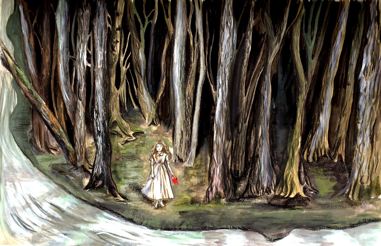


The main thought behind this piece was that it is the first time she has ventured away from home, and 'out into the wide world'; this subliminal message is portrayed by her small size in contrast to with the tall trees. She is away from the comfort of her house and about to go on an unknown journey.
When a piece of the mirror gets in a person's heart, they "become like a lump of ice". Here,
I have taken this literally. I am quite pleased with this image as it has a sense of abstractness, yet it isn't fully abstract either.
The rose is another major recurring theme as it is Kai and Gerda's favourite flower. When Kai kicks it
over then, it is quite a dramatic moment and a strong message so I think it might work better if it was just the rose. The kicked over rose also represents Gerda's hurt feelings afterwards.
Kai and Gerda together in the beginning, this image compared to the rest I wanted to create an
aura of happiness and joy as this will later contrast quite extremely with the long voyage
Gerda undertakes.
"The Demon and His Mirror", Selina Quach, 2014
I wanted to depict a calm and peaceful background, thus the clear sky but with a little cloudiness up ahead which foreshadows the breaking of the mirror. The peaceful atmosphere is also contrasted by the strong black figure in the sky.
"Past the Moon and Over Hills", Selina Quach, 2014
The emphasis here was on the paragraph that describes the wonderful scenery happening around Kai and the Snow Queen in chapter 2. The full moon symbolises "height of power, the peak of clarity, fullness and obtainment of desire" which I felt was suitable for this scene as The Snow Queen has taken what she wanted and therefore symbolically at the "height" of her power.
"No Peace Or Rest In Her Eyes", Selina Quach, 2014
In keeping with the moon symbolism (as it is a strong symbol for magic which is a dominant theme in the book) the new moon here represents new beginnings/rebirth. Kai sets eyes on the Snow Queen for the first time and a change is about to occur.
Kai Sleeping At The Feet of the Snow Queen - Selina Quach, 2014
The splash of red for Kai's gloves represent the small yet still present tie between him and Gerda. This technique I think I will be using throughout the book. I painted the light on the floor almost reaching Kai to emphasise that he is now in darkness (within the Snow Queen's domain) and unable to leave.
Friday 28 March 2014
Using Brush and Ink to Create Compositions
Initially I have been sketching out compositions as thumbnails but this week I have found it quite helpful to create bigger ones on A3 paper with brush and ink.


Following Jonny's advice about filling up space in my paintings, I realised this was due to my not being used to drawing on A3 as I've always preferred A4. However, it's been quite a refreshing change working bigger as it allows me to go into more detail and these quick brush drawings have helped me a lot in making better use of space, on top of allowing me to be more inventive and less precious.
Wednesday 26 March 2014
Development of Side Characters
This is just a little further development of some of the side characters as they aren't ones that I have worked with much yet. Although the mix of wet gouache and dry pencil is working for me, I used this as a chance to experiment with different paper/media anyway. Here I worked in the A3 sketchbook I made with Katherine earlier. I'm quite happy with how I've brought each individual personality across so far.
 |
| The Old Lady Who Knew Magic |
 |
| The Finnish Lady |
 |
| The Robber Girl |
Monday 24 March 2014
Week 8
- Creating bigger composition-based drawings with ink
- Working on different kinds of paper rather than water colour paper in order to work a bit more loosely
- Side character development
- Experimenting with fine liner and water colour
- Continuing to produce illustrations for different parts of the story
Sunday 23 March 2014
Shortening the Text
The last couple of days I have been concentrating on compressing the text so that it is more suited for the kind of book I want to go for. It was quite difficult at first because it is very long and there are quite a few vital parts to it as well as parts that I felt gave the story character. In the end, however, I knew that it isn't the writing I am trying to emphasise, but the art work.
I had a look at an existing shortened version of it via this website http://shortstoriesshort.com/story/the-snow-queen/ which really helped to get me into the mindset of writing concisely and to the point.
I have completed it today but am aware the text may need some further tweaking in the future after I have produced some of the illustrations!
The target audience for my book will still be to appeal to both children and adults.
 |
| Listing and planning out the illustrations on each page |
Friday 21 March 2014
Tutorial with Jonny
Yesterday I spoke to Jonny about my work. He gave me some helpful advice, some of which have slightly changed the direction of my work. Below are some of the points mentioned:
He also showed me a book called Bedtime Tales for Sleepless Nights by Jake & Dinos Chapman in which the layout is much more simple than most current illustrated storybooks. It is unusual in that it features a page of short, concise text about a paragraph long, complemented by a single illustration on the next page.
At the beginning I wanted to design it to look like the contemporary children's book but in actual fact, I quite prefer this idea as I want my images to be the main focus, as well as because paintings would probably work better in this format. The large text is quirky and fun to read, and the whole concept of the book is reminiscent of early fairy tale books - seeing as that is one feature I want to bring into my images, this direction would be in keeping with that theme. My final idea will kind of be like a slightly more modern version of an old fairy tale book.
I then went to look at some old fairy tale and myth books for some potential ideas of how mine could be laid out.
- Use of flat colour with texture is working well as it creates a nice contrast. I will be continuing with this technique
- Too much extra space in my images, Jonny suggested I compress some of these to make them busier and more interesting rather than letting the eye wonder
He also showed me a book called Bedtime Tales for Sleepless Nights by Jake & Dinos Chapman in which the layout is much more simple than most current illustrated storybooks. It is unusual in that it features a page of short, concise text about a paragraph long, complemented by a single illustration on the next page.
At the beginning I wanted to design it to look like the contemporary children's book but in actual fact, I quite prefer this idea as I want my images to be the main focus, as well as because paintings would probably work better in this format. The large text is quirky and fun to read, and the whole concept of the book is reminiscent of early fairy tale books - seeing as that is one feature I want to bring into my images, this direction would be in keeping with that theme. My final idea will kind of be like a slightly more modern version of an old fairy tale book.
 |
| Bedtime Tales & Sleepless Nights, page 1 |
 |
| "Bedtime Tales & Sleepless Nights" by Jake & Dinos Chapman |
 |
| The Serpent with Eight Heads, Japanese Myth |
 |
| Edmund Dulac Book of Fairytales |
 |
| Bluebeard by Quiller-Couch, Arthur Thomas |
Monday 17 March 2014
Week 7
- More media experiments
- Painting compositional sketches
- Degree show presentation workshop
- Tutorial with Jonny
- Shortening the Snow Queen text
Sunday 16 March 2014
Planning The Layout, Pacing and Narrative
This week I have been continuing with media experimentation but decided that it was probably a good time to also start working out how I want the final layout of my pages to look like. I started off by rereading through the text and sectioning off areas that I felt were the major scenes and then the slightly less important ones (as these could be smaller illustrations)
I've also been thinking about how certain images may look better; as a double page spread, vertical/horizontal, one full bleed page, within a frame or even a floating image on its own.
To help with this, I have been researching contemporary (and some old) layouts of children's books and getting ideas from them. Here are a few layouts used in children's books that I found interesting and might be applied into my book:

I've been sketching different ideas for each scene within the story. Choosing which images to draw will be very important as well so that the story flows naturally. To do this, I've chosen the most important scenes to the story as listed below. Some are quite vague as I'm not sure yet how to approach these.
There are some other ideas for scenes that I've had that, although may not be vital to the story, will make an exciting/vivid illustration or they may just make the story a bit more engaging. These I've made into a separate list:
I've also been thinking about how certain images may look better; as a double page spread, vertical/horizontal, one full bleed page, within a frame or even a floating image on its own.
To help with this, I have been researching contemporary (and some old) layouts of children's books and getting ideas from them. Here are a few layouts used in children's books that I found interesting and might be applied into my book:
 |
| Using a container with imagery inside |
 |
| Whole double page of illustration with text on one side |
 |
| Illustration going on in the back ground with text in front |
 |
| Sections to show different areas of one place or to show time passing? |
I've been sketching different ideas for each scene within the story. Choosing which images to draw will be very important as well so that the story flows naturally. To do this, I've chosen the most important scenes to the story as listed below. Some are quite vague as I'm not sure yet how to approach these.
- The demon/enchanted mirror
- The beginning - Kai and Gerda
- Kai seeing the Snow Queen through the window
- Mirror fragment getting into Kai's eye and heart
- Kai flying away with the Snow Queen
- Snow Queen's kiss
- Gerda/river
- Scene with the Old Lady
- Scene with the Raven
- The Royal Palace
- Gerda captured by the Robber-girl
- Gerda leaving with Bae
- A scene with the Finnish Lady
- Ice Palace illustration
- Gerda and Kai reunite
- Ending scene
There are some other ideas for scenes that I've had that, although may not be vital to the story, will make an exciting/vivid illustration or they may just make the story a bit more engaging. These I've made into a separate list:
- Other variations of Kai with the Snow Queen (wrapped in her fur/sitting on sledge etc.)
- The toy soldiers
- Interior of the Old Lady's cottage
- The Old Lady's enchanted garden
- The Old Lady's sun hat
- Gerda sitting under a tree looking at the Raven
- The dream-like shadows in the corridor
- The prince and princess
- Carriage leaving with the Raven watching
- Robber-girl giving Bae to Gerda
- Kai trying to spell the words "Eternity"
 |
| Composition sketches for the major scene with The Snow Queen and Kai on the sledge |
 |
| Kai getting a piece of the mirror in his eye and heart - perhaps use symbolism in surroundings to show the urgency of the situation? |
 |
| Planning book layout |
 |
| The meeting between Gerda and the Old Lady who knew magic |
Monday 10 March 2014
My Self Promotional Piece
After running into a few complications and having to make some last minute decisions, I completed my self promotion piece and sent it off on time today to arrive for the crit with Jonny on Thursday.
In the beginning my idea was to create a fold open book and I had ordered some custom stickers from Moo.com to seal it with but unfortunately they didn't arrive on time. On top of that I realised that printing on the art card was too thick to fold it the way I wanted to anyway so I changed ideas quite rapidly.
I ended up making a concertina booklet and bought some clear plastic greetings card bags to put them in, which in hindsight probably worked better as it was see through and more likely to catch the art director's eye.
I added some red ribbon for practical purposes and for effect as well since it matched the colour scheme of the illustration on the front.
I chose illustrations that a) varied in composition and b) showed different scenes which might be found in a children's book, as that is the main area I am targeting at.
I will also be ordering some custom postage labels this week and then post them off to publishers!
 |
| Self Promotion Piece packed, Selina Quach |
 |
| Self promotion piece, Selina Quach |
Week 6
- Self promotion complete
- Self promotion crit
- Talk with Brian Grimwood
- More development of images that could be used in my book
- Planning book layout
Sunday 9 March 2014
Deciding on Mood, Atmosphere & Colour Palettes
I've started to focus on producing illustrations from the story this week, as shown below. I've been drawing less character designs as although they have been helpful for me to get a foothold on the different characters' personalities and demeanours, they won't be the main focus of the images.
There's quite a lot of fantastical imagery in the story, and I want the main emphasis to be on the mood and atmosphere.
Next week I plan on playing around with material more and some different colour palettes, perhaps more muted but with one single bright colour. I really like the colour palettes of some of the traditional fairy tale illustrations such as by Edmund Dulac and Kay Nielsen, so I will be referring back to them for inspiration. I'm aiming to keep my images contemporary, with a hint of traditional fairy tale.
 |
| Selina Quach, Gerda and Bae character conept, 2014 |
 |
| Reindeer's Kiss, Selina Quach, 2014 |
 |
| Kai and the Snow Queen, Selina Quach, 2014 |
 |
| Gerda Afloat the River, Selina Quach, 2014 |
 |
| Nightingale Bridge by Edmund Dulac. These are some old fairy tale/myth illustrations that I like the colour palettes of. Will definitely refer to this for inspiration in my own images |
 |
| Kay Nielsen, illustrations of Scandinavian Fairy tales, 1914 |
Wednesday 5 March 2014
A Trip to The New Forest
 |


 |
| Trees and path, useful for illustrating Gerda leaving in the carriage |
 |
| Could be used as an image when Gerda is being dragged away by the river on boat? |
 |
| Still lake. Could be interpreted as ice in the Snow Queen's palace |


And some observational sketches...


Overall these will be very helpful and inspiring in creating images for my book!
Subscribe to:
Posts (Atom)