Friday 9 May 2014

Bibliography


  • Andersen, H.C (1845), The Snow Queen
  • Bettelheim, B. (1976), Uses of Enchantment: The Meaning and Importance of Fairy Tales (Penguin)
  • DK Publishing (2008), Signs and Symbols 
  • Tresidder, J. (2003), 1001 Symbols (Duncan Baird Publishers)
  • Lederer, W. (1990), The Kiss of the Snow Queen (University of California Press)
  • Lewis, N. (2010), The Snow Queen (Walker)
  • Chapman, J. & D. (2012), Bedtime Tales for Sleepless Nights (Fuel)

  • www.steelthistles.blogspot.co.uk/2012/02/snow-queen.html
  • "Frozen Heart: Growing up with the Snow Queen" http://quod.lib.umich.edu/cgi/t/text/text-idx?cc=mqr;c=mqr;c=mqrarchive;idno=act2080.0047.311;rgn=main;view=text;xc=1;g=mqrg
  • www.surlalunefairytales.com
  • http://en.wikipedia.org/wiki/1840s_in_Western_fashion
  • http://en.wikipedia.org/wiki/The_Snow_Queen
  • http://shortstoriesshort.com/story/the-snow-queen/ 
  • www.pinterest.com

  • The Snow Queen an animated short (1992), Narrated by Sigourney Weaver
  • The Snow Queen (1957), Director Lev Atamanov

The Future

Following up from my previous post, I'm going to talk about my goals and what I hope to achieve after this project and the course ends. By the end of the year I aim to be in the full swing of freelance illustrating whilst having a part time job on the side, hopefully related to my industry. Even while I am not receiving commissions I intend to carry on creating images whether they are self initiated or group projects or for competitions which I can then use to update my website, blog and other social networks and this will still be helpful to gain more exposure. I think it would be quite nice to continue with the theme of fairy tales, fantasy genre or something similar. Where my version of The Snow Queen was a bit more focused on scenery I would like to do something more character-related next time. I am primarily aiming towards children's book illustrations but I also want to keep my work open-ended enough to get commissions and illustrate for an older audience. I will be sending my finished artwork for final major project to children's book publishers, both ones that are more well known and also less well known as these are the ones more likely to pick you up if you have just started out freelancing. I am also contemplating joining an agency but will need to do more research on this as I understand that finding one that is suitable for my work and is reliable will be a choice I need to make carefully.

By the start of 2015 I am hoping to have gained a decent amount of exposure with the help of social networking and sending out new self promotional pieces. My self promotional piece will probably contain the new illustrations I've developed for my final major project, and now that I have purchased an A3 printer and scanner it will make it much easier to print in bulk and send out to relevant persons. Joining groups on Linkedin, Society of Children's Book Writers and Illustrators etc. will also be helpful to reach out to like-minded people and build important connections.

All in all, I feel I am well prepared and am looking forward to begin my career as an illustrator!

Reflecting on Final Major Project

As I am coming close to the end of my project, I am going to look back on my progression over these few months and review what has been both successful and unsuccessful in terms of development and end products.

   In regards to organisation, I think I have planned out what I had to do in the time I had fairly well, however there were a few things I felt I could have spent more time on and spent less on others. Whilst researching the text and characters at the beginning, I think it would have been more productive to have begun drawing straightaway even if I didn't know what I was doing, which I did do to an extent, but I realised that any image throughout the project can be a possible final image.

   In the beginning I also sketched a lot of thumbnails to see how each of the illustrations could look; I think that in the future, I will sketch each scene consecutively as well as focusing on one scene at a time as this would have aided me in seeing the progression of events in the narrative a bit more clearly. This didn't effect my creative process too much however.

   Overall, I have stuck to my timetable quite well, which I was surprised at. I was able to access some places to draw things such as woods, people and architecture as stated in my proposal, though with future projects I'm going to aim to find other areas to draw from life as I will have more time on my hands once I've finished uni.

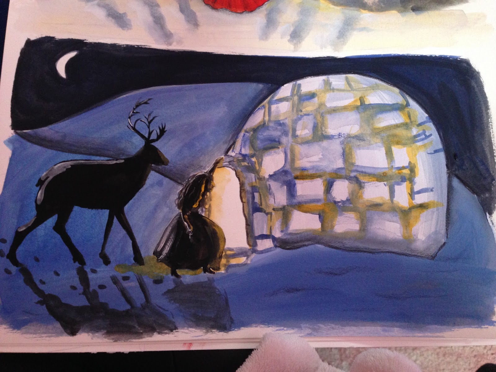
   As for my images I am pleased with the atmosphere I have created in most of them and feel that I have managed to incorporate symbolism subtly and effectively. I'm also pleased with how some of my images have come out so you have to look more closely to see certain details in the picture, which can be quite nice as an additional feature. I think I could have varied the composition a bit more as a lot of the images are scenery-based but overall they've worked reasonably well. Although at first the colour palette was not what I had aimed towards I think the colours I have used has worked well as the dark colours contrast nicely with brighter colours, hinting at symbolism eg. Gerda's red shoes and it also lends towards the overall dark theme throughout the story.
I am now more confident of the style I want to work in, taking what I've learnt from previous projects. Painting quick ideas with a brush and ink have been really helpful with developing my images as well and this is something I'll be carrying on.

   All in all, I'm very proud of what I've achieved and it has definitely taught me a few things in terms of image making as well as the technical side of things like binding books and using Indesign which I did not know how to use previously. These have all prepared me for future work and commissions.

Thursday 8 May 2014

Designing the Dust Jacket

Over the past week I've slowly been putting together the design for the dust jacket among everything else and have almost completed it today. Looking at it now, I feel that the entire image might be more effective with something in front of her face, such as her hand or part of Kai's face - then again, it will fold over the cover as a flap which means it might not matter so much. I still have plenty of time to adjust things if I do change my mind however once I've bound my book.

I decided to keep the cover simple and more graphic compared to a full scene as I want it to stand out from a distance, so I used the Snow Queen's head as a container for the text. I spent a while trying to find a traditional yet slightly contemporary font for the title.
I have painted her hair so it is a bit less defined than her face to make it seem almost like the snow or wind, as I imagine her to embody the snow or be a part of it.


Wednesday 7 May 2014

Adding Spot Images & More Symbolism

Today I've just been creating a few more illustrations which I'll edit into my book to fill up the space around the pages with text as it'll help to keep them more consistent and interesting to look at. 
All of them are related to the scene that is happening on the page they are on.
The sleeping dove, shoes, comb and mirror fragments are all important objects in the paragraphs whilst the others are more meant as accents for the story.

I've been using birds as another recurring theme as they can represent a number of things.
The Raven for example is a helpful and noble character in the story; he is a symbol of hope and a guide to Gerda, and overall a strong symbol. The sleeping chained dove and the bird on the branch (when the Snow Queen kisses Kai), both represent purity. The bird on the branch also symbolises Kai's vulnerability to the Snow Queen, just as a bird might be vulnerable to the harsh winter.
 
After I've added these as the final touches to my book on Indesign, it will all be ready to print out next week! 
Once it is bound I can also then measure the spine and adjust my dust jacket design to print out.

Monday 5 May 2014

Hullabaloo

 Today I finished off my piece for our course's hullabaloo themed newspaper. I wanted it to be connected to my final major project so I drew a spin-off to the ending of The Snow Queen. In some versions of the fairy tale including the original, during Gerda and Kai's journey back home they encounter one by one all the characters they met through out the story and so here I've drawn them gathered together, celebrating Kai and Gerda's reunion. The Robber-girl undergoes the most drastic change when they meet her again, she is described to be wearing "a shining red cap on her head, and pistols in her belt".Though she at first comes across as tempestuous and a little scary, she ends up choosing to help Gerda. In this image I've drawn confetti coming out of her pistol which is unexpected, symbolic of her personality in the story

After scanning it in I played around with Photoshop a bit and ended up with three versions, each varying in the hues. Out of these I prefer the one at the bottom the most.


Week 14


  • Presentation Document meeting
  • Tutorial with Louise
  • Hullabaloo illustration
  • Cover design
  • Adding small images onto some pages

Sunday 4 May 2014

Creating the Title Page

Today I've been creating some title page designs. For the first design I painted part of the land where the story is set and included the river with Gerda's shoes and the Snow Queen's palace in the distance. It is meant to be sort of a preview to the story where at first you would not know the significance of these objects until after you have finished the book. I've kept it deliberately water-downed and lowered the opacity as I wanted the emphasis to be just on the words. I've also made the hues change from sepia toned to cool toned from the first page to the other, it represents the seasons changing throughout Gerda's journey, except here it happens in one picture. At the moment I'm unsure whether to use white or black text; I think black might be better as it will stand out more but I will get Louise's advice when I see her next week. 


Below are a few other examples I could use as the secondary title page (the one before the main title spread). I made these with boxed images instead of full page ones as I think if there were too many full pages at the beginning it may not go with the rest of the pages where most of them also have boxed images. Out of the two below I prefer the bottom which is more simple and seems almost like a pattern with its repetitive trunks.


Friday 2 May 2014

The Pick Me Up Festival & Buying Portfolio/FMP Supplies

Yesterday I went to the Pick Me Up festival with the course; it was very exciting and inspiring to see so many contemporary artwork all in one space. Although most of the art wasn't very similar to the style or medium I work in I still felt quite inspired by many of the illustrators - I especially loved Isabel Greenberg's work who gave a talk earlier this year, Jessica Das and Damon Smith's work which I've pictured below respectively.
Isabel Greenberg display


Etchings by Jessica Das


Damon Smith


I purchased a portfolio case as well and decided to get an A4 size one as I prefer to work smaller and I think it suits my work in this size. Because I am aiming towards book publishing it will also be easier for the art director to imagine my artwork in their publications.

Additionally, Emma and I walked to Shepard's Bookbinders which is around 30-40 minutes away from Pick Me Up. It was much more convenient being able to see and touch the paper there rather than just ordering online. With the size of my book Katherine advised me to get between 120 - 140 gsm which unfortunately did mean the images might show through a little, but not too much. I ended up getting Simili Japon inkjet paper which is off-white and I feel will suit my images more.  
All in all, it was an enjoyable day and I got a few essential items I've been needing for a while! 

Thursday 1 May 2014

The Final Illustrations For My Book

These are the final images I've painted for my book. Again, I've had to take references from photos on Pinterest for certain illustrations such as the ice palace (see this post http://selinaquachfmp.blogspot.co.uk/2014/04/designing-snow-queen-palace.html which explains more in detail what references I've been looking at for inspiration) and the ruined castle as I was unable to access these places.
  
In this image I wanted to emphasise the transitional stage from summer to autumn as Gerda is very shocked in the book to find out it has already turned autumn-time. The symbolism; the dark tree with dead leaves represents Gerda's emotions at this stage of the journey, which is contrasted by the rays of light representing hope and optimism upon the news that the Raven brings.

The trees are bare here signifying winter is coming. The Raven is the main figure in this image as he watches over Gerda's departure and emphasises the feeling of separation 

This image subtly reflects back to the time when Kai was sleeping at the feet of the Snow Queen; Gerda is scared and worried sleeping with the Robber Girl and would rather be anywhere else than here. 


This is meant to be the mirror opposite of The Snow Queen kissing Kai - the emotions of love is much more genuine here and is meant to emphasise the fact that the Snow Queen's kiss was in order to lure Kai  and is not a true representation of love. The colours are brighter and gentler in comparison to the starker, harsher colours in Kai's scene.

The last image of the book. Kai and Gerda have returned to the roof top they spent theirs summer days at the beginning of the book. They've obviously changed and grown up but the same roof top reminds us that they are still the same people, still "children at heart". The softer pink shades in this image  symbolises calm and tranquility as well as "compassion, nurturing and love. It relates to unconditional love and understanding".
The roses are drawn less closely together and isn't framing the two of them anymore; this symbolises the huge journey they have both undergone - they aren't within the safe walls of childhood and seeing things in a limited perspective anymore. They have seen both the darkness in the world as well as real beauty. 

Wednesday 30 April 2014

Creative CV

Today I finished my creative CV. I wanted to keep it fairly simple and concise and clear enough read. I also added a few small drawings as finishing touches which I'm quite happy with as it shows I enjoy working traditionally and it contrasts with the text.


Tuesday 29 April 2014

Group Work In Progress

This morning I had a group work in progress with Louise where I showed my second more finalised mock book. Although I am quite happy with it I felt that some of the pages were looking a bit empty and she agreed with me. So in the next couple of weeks I will be drawing some small illustrations to add onto the pages in order to make things a bit more exciting and in addition I will definitely be making the main images larger.
Here are some quick doodles in my dummy book that I did after the WIP, which may be used as extra illustrations.


We also spoke a little about how I am going to display my work for the degree show and I think I am going to go for old/vintage looking frames, as it is a traditional fairy tale and may go well with the paintings. I will probably put up original art work as I think it will be a nice feature to see the physical hand-made illustration next to the printed version.

Monday 28 April 2014

Week 13


  • Group Work in Progress with Louise
  • Finishing creative CV
  • Re-sizing page spreads on Indesign, test-printing etc.
  • Buying book paper & cutting it to size
  • The Pick Me Up Festival
  • Creating title page

Gathering Ideas and Inspiration For Creative CV

Today I've begun to think of some ideas for my creative CV. I started off by looking at some examples of others' creative CVs to give me some inspiration. Here are a few that stood out to me the most:
I like how this has been laid out like a newspaper, making it
more fun and giving it a bit of context. Drawing little illustrations
for each of the different sections is also a nice idea as it gives you
a chance to show your style and that you can draw different things
which is always good!
I also like the idea of a limited colour palette as it
gives the overall CV a look of professionalism. The way
he has introduced himself is also quite fun and informal
Although I don't want to type a lot of text as the employer
might not read it all, I do like the colours used in this and
the patterned background. Compared to the two above this has
more of a hand-drawn feel which I think is because it is an
illustration CV instead. Mine will follow this route more
 as I focus on traditional media.
This is a nice and simple idea which I could pursue, with one illustration to the side.
The descriptions about the person are short, concise paragraphs that get straight to the point
which is what we were advised to make sure of during the workshop. Again, use of
limited colour is appealing.

Saturday 26 April 2014

Second Dummy Book & End Paper Design

The past few days, I've just been getting all my images done so far together and putting them on Indesign. Although I still have roughly three weeks left to make further changes, I feel like it would be a good idea just to formalise what I already have. This will be helpful for me to a) get used to Indesign and b) see how the overall book is looking so far and what I can do to improve it, which will coincide well for next week as I have a WIP on Tuesday. I've ordered the pages in the way that it have to be to sectionally bind it which was quite confusing with so many pages however it'll definitely be helpful to do a while in advance.


Second Mock Book

Second Mock Book (2)
I've also designed my end paper that I'll be using for my final book. This is from an image in my sketchbook that I drew for initial research. The simple pattern will make a nice contrast with the inner paintings.

Another illustration depicting the shadows/dreams in the Princess' palace. I prefer the shadows and wallpaper in this one as they are more delicately drawn. For the wallpaper I searched for 1800s patterns again for reference but chose a swirly design as it reminds me of the dream-like quality of this particular scene where Gerda is hurrying along the hallway and sees the magical "dream forms" of the people sleeping in the palace. 

The Snow Queen's palace - I wanted the palace to look like it was part of the landscape rather than just a palace on its own which I think I have done successfully. I'm happy with how the red looks here contrasted with the paleness of the entire image as it gives it a splash of life. This is to symbolise the stark difference between The Snow Queen and Gerda - the palace is cold and desolate (representing the Snow Queen) whilst Gerda, though just a small girl, represents all that is opposite to her - love, warmth and bravery.


Tuesday 22 April 2014

Macmillan Roughs & Photoshop Experimentation


 Today I have mostly been preparing for the Macmillan competition as the deadline is soon. The brief is to submit roughs of a children's picture book from cover to cover (with some finished artwork as well), so I've been sketching out some would-be illustrations as pictured below. I have chosen my strongest images to be sent off as fully finished artwork, and I should have it all ready as one PDF by tomorrow!

It's been quite helpful/refreshing to do these actually as it's been a while since I last did a mock book, and now I can see all of my images (of which most of them will probably be the final illustrations) together. It's helped me to pick out which ones may not be needed or whether there should be another for a certain scene in order to make the story line more consistent/flow better.


Yesterday I've also been scanning in a lot of work and enhancing the images I've got on Photoshop, just to make some of them a bit brighter or more contrasted, ready for printing as a book. It's also helpful to just see things on a screen as it changes how you see the image, opening up more pathways for adapting and experimenting.


Monday 21 April 2014

Week 12

  • Further paintings and editing in Photoshop
  • Producing roughs for the Macmillan competition
  • Organise pages/place images on Indesign
  • Create a second more finished mock book, ready for feedback on Tuesday's WIP

Sunday 20 April 2014

More Paintings and Taking Inspiration From Pinterest Board

As I've not been able to access some places to draw from life, unlike The New Forest for woodland scenes, people & architecture, I've instead gathered some images from my Pinterest board that I've been keeping to draw from and have as inspiration. 
For the images below for example I had to look up the Northern Lights for reference and igloos.

This was a painting produced earlier but I prefer the later one I did (below) as I feel it reflects the atmosphere (danger & mystique) of the situation better. The first one almost feels like there is too much going on, distracting from what is actually happening.


Gerda and Bae; to emphasise the joy and wonder they both feel at seeing the Northern lights, I did this as a double page spread so the scenery stands out as much as the characters.

This was again, not originally going to be one of the images in the book but I think it is quite successful as the characters being silhouettes creates more dramatic emphasis of the night. It is also quite different from my other paintings which is good as I want to vary them a bit.

Here I've begun small drawings that could be an addition to the pages of my final book. I like the idea of adding the toy soldiers in as although they aren't "alive" in the book there's a certain characteristic to them that makes you almost believe they are real (similar to Gerda in the story)

This idea for an image came from seeing a picture of a wisteria tree on Pinterest. They are quite unique trees and as the old lady's garden is full of wonderful and different flowers/plants as described in the story, I thought this was fitting. I depicted Gerda wondering through the beautiful wisteria flowers looking joyous but the tree that fills up most of the page and completely surrounds her, also represents how lost she is - physically far from home and mentally her thoughts are far from Kai and her original goal. Purple incidentally is also the colour symbolising magic.


Saturday 19 April 2014

Designing the Snow Queen's Palace

Today I've begun to sketch some ideas for the ice palace featured in the story. Although the words "ice palace" makes me imagine of many different ideas, I didn't want to just draw what I first came to me, so I started by drawing buildings from life including Winchester church which looked quite elaborate and grand, similar to what I had in mind for the ice palace. I also sketched some palaces from the 1800s.

Aside from drawing real buildings I did some study sketches of ice stalactites and icebergs; things made of ice that had a certain structure to them. I think icebergs are great for this as they are quite isolated yet grand to look at which is how the ice palace is portrayed as - it is a representation of the Snow Queen herself - as she is is also an isolated and beautiful figure.

I am going to use both within my design for the palace. 


Friday 18 April 2014

Interpreting Scenes In Different Ways

Having another look at my timetable, the deadline seems to be coming up closer; although I still have 5 weeks to finish everything I still need to leave time to send my work off to be printed, then bind my book with Katherine. 
So this week has been another solid week painting. Even though some of these might not be used in my book, I painted some different interpretations as afterward I had thought of another idea for portraying a particular scene.
At first I painted the old lady with magic cropped in. I liked this version as it made the focus primarily on the hat which is poignant in the story. However, I felt it was lacking something, and it was quite difficult getting the head proportionate with the hat!

1. The Old Lady - I tried a full body illustration instead which I think works 
better as you get more of a sense of mystery with her 
cloak and her hat still stands out as I made the rest of the 
image quite simple in comparison. You are now able to see a contrast between the size of her hat and body.

2. Kai and Gerda - This was another try at depicting the scene at the very
beginning, which again I think is an improvement. It is meant to be polar opposite to the one with them looking through the window at each other, therefore I emphasised the sense of closeness and used brighter, vivid colours. Green and orange for their clothes are to symbolise youthfulness and cheerfulness

The Robber Girl - I feel like most of my images so far don't feature very many characters up close, which kind of detracts from the story a little. So I thought the entrance of the Robber Girl would be perfect to illustrate in this way as she is a very prominent character in the story in terms of personality. This scene is much busier/crowded than usual as it is a very action-packed description in the paragraph.
I've been keeping the symbolism of the moon throughout as well. Here the waxing moon was suitable for this moment as it represents growth - the Robber Girl's story is halfway through Gerda's journey and I think is the main stepping stone for when she is truly "grown up" at the end of the story. 

This is a scene that I hadn't thought to do before as it was not as obvious as others, but I quite like how it captures the suspense and mystery as Gerda is about to see whether it is truly Kai.


The two above are variations of Gerda when she is carried away by the boat. The first I like as it captures the movement and danger of the description. The other I am not sure about yet; it emphasises more her feeling of being lost and not knowing what to do - I do quite like the juxtaposition of the shoes but it may be too similar to other illustration compositions. That will be something I need to be careful of. 
In  the previous version of this painting the characters were depicted more closer to life, in this one they are more stylised. This is because I feel it gives the characters a bit more personality/quirkiness. I feel that children would then be able to identify with the characters more than if they were simply drawn true to life with every detail.